Saturday, April 27, 2013

When Wiil They Learn?

When will professional franchises and universities and colleges learn that there is no such thing as a minor redesign, or small modification of a classic uniform? In the interest of fairness relating to my last random thought post, I thought it would be appropriate to use an example from the cross-town rival of SC, UCLA.

This one hurts.

As previously stated, I am no SC fan. I am a huge UCLA fan though, so this isn't going to be easy for me. A couple random guys to give my argument some historical perspective:


We all know the UCLA history here, they had a decent coach, they won some titles, etc. As previously mentioned, the recent uniform change appears to be innocuous/insignificant and is somewhat difficult to detect to the untrained eye. Can you spot the change?


What happened to the waistband? Or to be more succinct, what happened to the blue and gold trim on the waistband? The elimination of the contrasting-colored waistband began to be seen in college basketball uniforms over the last decade or so (thank you Nike.) This uniform trend has spread like a virus to the NBA as well and has become the norm, with only a select few classic uniforms (Celtics, Knicks, Bulls) left that do not employ the "jumpsuit look." Even Skip's Spurs, who had one of the coolest ABA/NBA unis ever, have gone to the jumpsuit look.

The one and only George "Iceman" Gervin


Tony, Tim and Manu rock their jumpsuits


When did someone decide that basketball players would look better in a jumpsuit, as opposed to a tanktop and shorts? And if we were to extrapolate a bit, can we ever expect to see a basketball uniform that looks like this?


How Nike Ruined College Basketball

This random thought will be a prequel to a series that will focus on the current state of college basketball uniforms, specifically how "non-traditional" designs by Nike have contributed to the desperate situation that now exists.

After sleeping through the Oregon State Spring Game on Pac 12 Network, I woke up to a replay of the SC-Oregon game from the Coliseum last fall. One glimpse of the new socks and shoes, which are now composed of the colors "USC Cardinal/PMS 201c and USC Gold/PMS 123c" made me sick to my stomach.

I'm no SC fan. I'm definitely not a fan of their wunderkind head coach, Lane Kiffen. What I was a huge fan of though, was their adherence to the traditional design of their football uniform. I'm no SC historian, and I'm too lazy/incapable of going back more than 50 years, so let's just go back to this:

Mike Garrett former SC great and Athletic Director circa 1965

It's not a HD pic, but it shows the traditional jersey, helmet  and pant, worn with white socks and black shoes with white shoelaces. If anyone can name the manufacturer of the cleats worn by Mr. Garrett in the photo above, then you're too old to be reading a blog. That's right though, they appear to be "Spot-Bilt" - truly and unapologetically old-school.


Some other SC "notables" that ran roughshod with their feet confined in white socks and black shoes include:                                              

Left to right: OJ; Charles White; Marcus Allen and Reggie Bush
 

I'm not sure what prompted SC to abandon over 50 years of tradition and "update" their uniform from the knees down? I want to blame Nike, but they only manufacturer the shoes and socks. You would think that changing a half century of tradition might require the approval of someone in a high position of authority, so the question is, who runs the show at SC? It can't be Kiffen, can it? He definitely is a prime suspect. Any guy that wears a visor is clearly capable of far more serious fashion-related offenses. Hard to fathom Rhodes Scholar and two-time All American Pat Hayden being the driving force, or signing-off on the change to cardinal and gold-colored shoes and socks. Do we need to go as high as President C.L. Max Nikias?

I would really like to know. Because this is a disgrace:

Monday, April 22, 2013

Bottom 5 MLB Uniforms


Not that there was anyone who was eagerly awaiting my "Bottom 5" MLB uniforms, but in the event that there was, I apologize. I got a little sidetracked with some random thoughts.

Bottom 5 MLB Uniforms (this listing excludes all "Alternate" jerseys since most are god-awful and should be worn only for batting practice on rainy days.) Remember there are 25 points possible.


26. Atlanta Braves Home (10 pts)


27. Minnesota Twins Home (6.5 pts)


28. Colorado Rockies Road (6 pts)


29. Tampa Bay Rays Home (4.5 pts)


30. Arizona Diamondbacks Road - or Home or Alternate - or Whatever (2.5 pts)


Okay, let me admit that 2.5 points is kinda harsh. I did take a half-pt (0.5) deduction for "General Principles" (in honor of the great Eddie Bane) but the numbers after that don't lie:
 
Team Colors (score=1)
Logo (score=0.5)
Cap (score=0.5)
Tradition lol (score=0)
Design (score=1)

The zero for Tradition was the only zero given for any category for any of the 30 MLB teams. The only "tradition" that the Diamondbacks have, is one of terribad unis:


Nuff said (apologies to "The Unit".)


If Something Ain't Broke

If something ain't broke...don't fix it. I like cliches. I also believe that this particular cliche should be applied whenever teams get the urge to change or tweak their uniform design.

Example: San Francisco 49ers

Joe Montana
The 49ers, somehow dissatisfied with only 4 Super Bowl titles from 1981 to 1989, decided at some point in the early 90's that it would be a good time to "move on," and "improve" a uni that is one of the best of all time in the NFL.


Steve Young


The unnecessary and gratuitous changes here may appear to be subtle, but the impact on the overall design is significant. Note the introduction of the black border and shadow on the numbers, along with a slight color change of the jersey base color. The 49ers also began to wear an "alternate" white pant with a crimson and black stripe. The helmet design and logo remains the same, an apparent oversight by the individual(s) in charge of the new uniform concept (this oversight would be addressed soon enough though - see below.)


The new look is now complete.


A gold outline now surrounds the white block numerals, complemented with the black shadowing. A red stripe with black outline now appears on the pant and helmet. The helmet cage is now that weird 'crimson' color, and the 'new look' was complete - well almost.


Oh Boy...


The infamous 1991 press conference, where the new logo was unveiled. If it's unclear why George, Eddie D. and Carmen look so unhappy, it may be time for an eye exam.


All is well that ends well.

 
Win-Win situation - whomever you picked to QB the Niners, they were gonna look good.
 

Wednesday, April 17, 2013

Random Thoughts

After reading over my last post, I realized that I'm going to have to do something to keep this from being boring. As a boring guy, this will no doubt be a constant challenge, so bear with me. I was thinking one way to mix things up would be to start every post with some randomness - anything that comes to mind.

Since i have no idea when I'm going to get around to posting my "Top 10" College Baseball Uniforms, I wanted to give props to Vanderbilt University for this uni:


Not bad at all. I do think it's a joke that when u click on a pic you are prompted to buy it on their "official website." I expected a little more from the 'Stanford of the Southeast.' Skip (Bayless) please tweet your Alma mater and tell them to get over themselves (no one is gonna pay for a Vandy baseball pic unless it's signed by David Price.)

Also, before all you big-brained snobs get too big-headed, there is also this:


Georgia Tech called, and they want their uni's back. And btw, I really hate this "flat gold" color. Let's take one of the most powerful colors, water it down, then try to contrast it with white?

[  ]  good effort Vandy.

Also, memo to Vandy, I'm going to take a full-point deduction from every uniform that you have (even the super-cool one at the top of the page) for your ridiculous/outdated basketball venue, Memorial Gymnasium. Congrats on the new video board though.


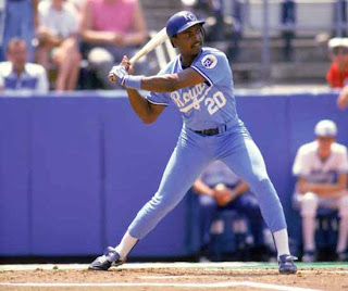
As I was selecting the "Top 10" current MLB Uniforms, I couldn't help but think back to this. Possibly the coolest uni of all-time.


Worn here in true 80's style by my man Frank White. For those of you fortunate enough to be too young to remember how we wore our unis in the 80's, note the tight pants, mid-calf height, with the stirrups pulled up high - so only a straight line shows.

Oh and before I forget, I'm so sick of seeing MLB teams wear throwback uniforms in the current style (as it relates to fit.)  If you can't be bothered to wear it like it was originally worn, then don't wear it at all. I don't expect a 24 year old player to know how we wore the unis in the 80's, but there is google for reference.

Ok, just one more random thought. My mention of the "Stanford of the Southeast" reminded me (unfortunately) of this:

 
Carlos Quentin (circa 2002)

In my 1st post, I listed 5 criteria that I use to compile a score, which determines the rankings of the teams listed in my MLB "Top 10." One of my 5 criteria is "Tradition," meaning the importance of not significantly altering the design of a good original uniform.

By no means did I intend to suggest that any franchise, school or other team should be bound to a uniform that has serious deficiencies. The uniform above, gracefully worn by the quick-tempered, mound-charging Mr. Quentin, is a textbook example of a classic uniform faux pas. Can you spot it?

Spoiler: A pull-over top should never be worn with a belted (or non-elastic waistband) pant. This terribad look was semi-popular at some point in the 80's, so it may not be entirely fair to single out Stanford as my example. The problem is that Stanford has not yet gotten around to correcting this mistake. I'm sure it's on their list since during the time since this guy

wore the cardinal and white pullover, they have changed their school nickname, burned through 8 head football coaches and built a new football stadium.

I'm sure it's on their list.

Next post: Bottom 5 MLB Uniforms


Tuesday, April 16, 2013

Top 10 MLB Uniforms

The purpose of this blog will be to discuss and critique the uniforms worn by all of the major college and professional sports teams, along with the clothing worn by a few select persons who compete in individual sports. The scope will therefore be very wide ranging, although I will try to focus on the 3 major team sports: Football; Baseball; and Basketball.

Since Opening Day is still fresh in my mind, I will start with baseball. While I intend to eventually compile a quantitative evaluation (or score) of each MLB teams current uniforms, for the moment I am going to restrict my evaluations to the "top 10" and "bottom 5" teams. I have created a point system based on 5 criteria:

1. Designated Team Colors
2. Team Insignia/Logotype (or Logo)
3. Cap
4. Tradition
5. Overall Design

Each criterion has a possible 5.0 points, for a possible 25 points total. In addition to the 25 points, there will be deductions of 0.5 to 1.0 points made for other weaknesses and or deficiencies.

Top 10 (current uniforms only)

1. New York Yankees Home (25 pts.)


Perfection.


2. Detroit Tigers Home (25 pts)


Close 2nd*


*When there is a tie, I will use the team's other uniforms as the 1st tiebreaker. In this case the Yankee's road uniform (which narrowly missed the Top 10) is far better than the Tiger's road uni (which sucks.)

3. Los Angeles Dodgers Home (24.5 pts)


Half point deduction for Tradition.


4. Pittsburgh Pirates Road (24.5 pts)


Best Road Uni.


5. New York Mets Road (24 pts)


6. San Francisco Giants Road (24 pts)


7. Baltimore Orioles Road (24 pts)


8. New York Mets Home (24 pts) 


 9. Kansas City Royals Home (24 pts)


10. Chicago Cubs Home (23.5 pts)


Coming up next post: Bottom 5