1. A Black, Blue or Red "primary" team color.
2. The use of a "secondary" contrasting color for trim and outlining - orange and gold work best.
3. The use of symmetrical striping on side panels of uniform top/jersey and bottom/pant/short.
One example of new "non-traditional" uniform that I like a lot is the Houston Rockets.
 |
| Linsanity |
Over sized mid court logos are a disturbing trend in college basketball these days, and this trend has unfortunately spilled over into the NBA. My solution? A rule stating that no more than 25% of a logo can bleed off the 12' diameter of the mid court circle.
I really don't mind painting the lane or the outline of the court a solid, contrasting team color, but the "staining" of the inside of the 3-point area is NOT a good look. I prefer a court design that looks like this:
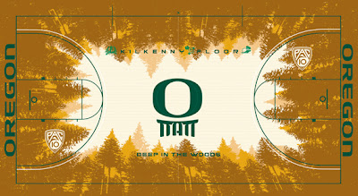
Of course, if you "Tinker" with a court design too much, you may end up with something like this:
 |
| The (Tinker Hatfield designed) Kilkenny Court at Matthew Knight Arena |
Not bad...if you're on mushrooms.


No comments:
Post a Comment